Insight
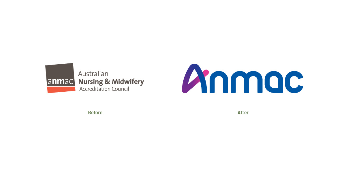
Stakeholder and market research confirmed that the existing brand felt dated, with strong internal and external appetite for change.
Anmac is built on a proud history, deep expertise, and a well-earned reputation across the health sector but stakeholders felt the time was right to pause, reflect, and reset. Crucially, there was a clear mandate not simply to refresh the brand, but to be bold, brave, and ambitious.


Strategy
Truly Deeply worked closely with the Board, senior leadership, stakeholders, and business consultants to align the new business strategy with Anmac’s future brand ambition and strategic proposition.
The result is a holistic brand framework that brings clarity and direction to internal and external audiences alike. The brand strategy includes a new vision, purpose, values, beliefs, promise, positioning, messaging, and personality.
The new personality builds on Anmac’s reputation as principled and respected. It also introduces more human, bold, and progressive traits. The brand feels fresher, warmer, and more relevant today.
Anmac is now written as a word, not in all caps. It’s how most stakeholders and staff already say the name. A small change with a big effect. The brand now feels more approachable and relevant.
Design
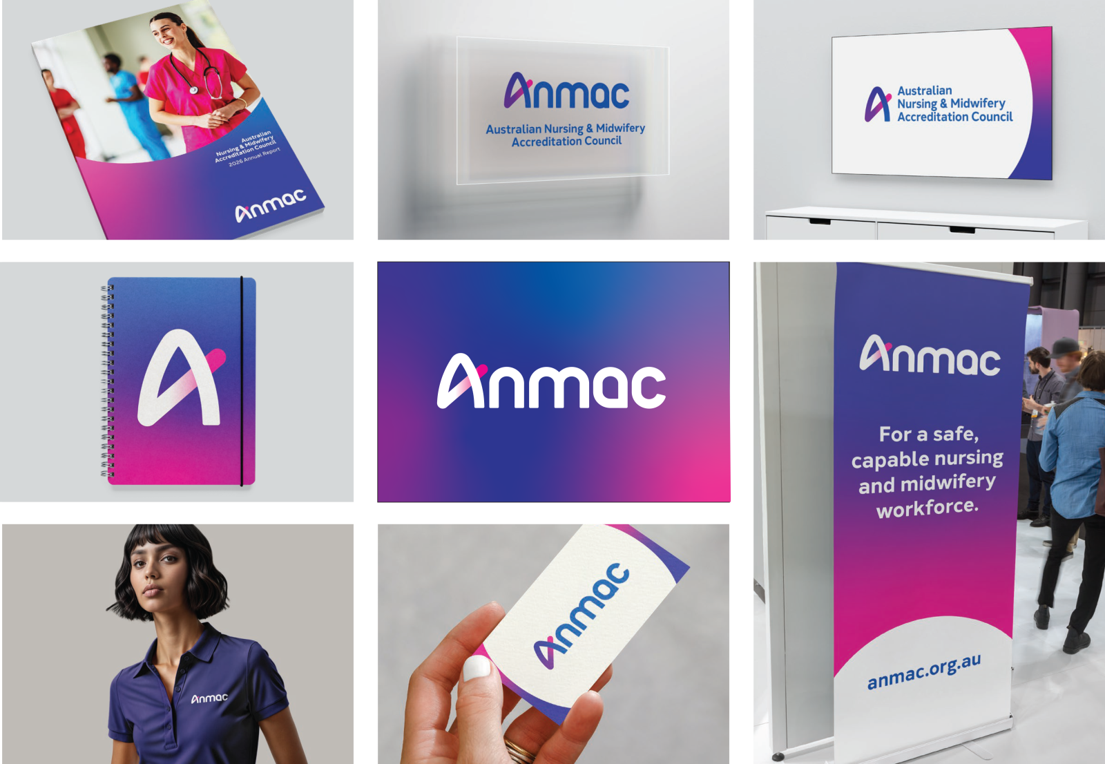
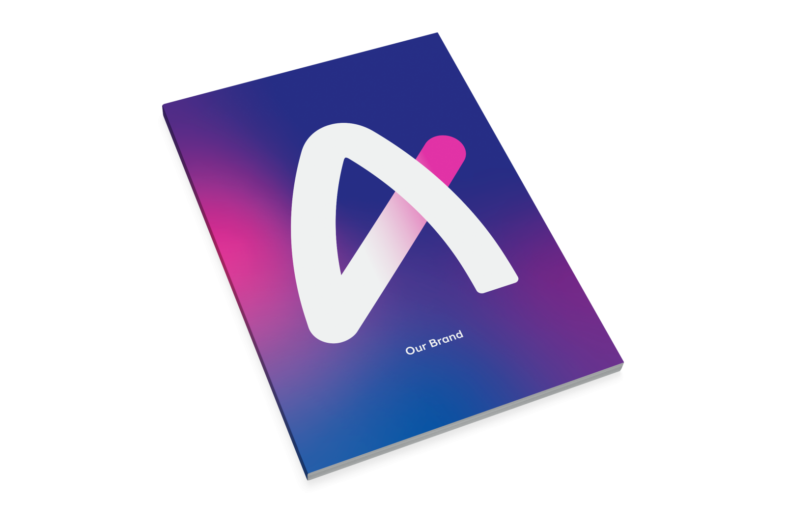
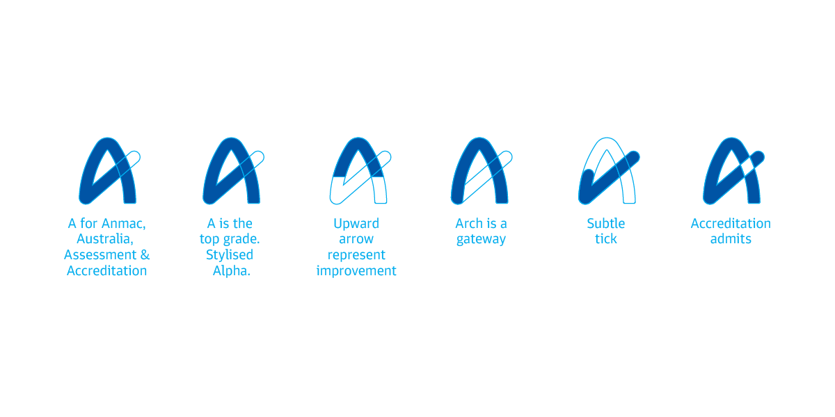
The new brand identity features an ‘A’ that stands for Australia, Assessment, Accreditation, and of course Anmac. It also carries the weight of the top grade, and the first: Alpha. Its crossbar is formed by a rising tick element. The tick through the A represents improvement and achievement. It passes through the arch of the A like a gateway, admitting entry to the profession.
As a full wordmark, the A leads a custom type. The letters are built from clean, rounded shapes with softened terminals. Bold and contemporary, without sacrificing warmth.
The visual language draws on the traditional colours of nursing and midwifery. We reinterpreted them through the lens of the sky at dawn and dusk. Navy is a colour of trust, shared by financial and medical institutions alike. Purple is royal and richly symbolic. Magenta is a primary pigment that evokes passion, creativity, and balance. Together they conjure the sky at its most expansive. A reminder of how wide our world is, and how optimistic life can be. A white sphere representing the sun completes the palette. It serves as a framing device for imagery that honours the community’s deep regard for nurses and midwives.
Brand Video
Results & Impact
The rebrand marks a clear step forward for Anmac. It presents a more proactive and contemporary expression of who we are and aligns strongly with the direction set out in our new Strategic Plan. Early feedback has been very positive, particularly in how clearly it articulates our role in supporting and providing leadership for a safe, capable health workforce and strengthening public trust.
”
Truly Deeply were highly collaborative and insight driven. The team demonstrated a strong ability to listen, challenge constructively, and translate complex inputs into a clear and compelling strategic direction. They brought both rigour and creativity to the process, ensuring that the brand was grounded in evidence and stakeholder insight, while also elevating how we present ourselves.
”
Camilla Rowland
Chief Executive Officer, Anmac