Insight & Strategy
Since 1999, Gadens has used the same logo nationally, but the visual language and brand communication were localised.
Truly Deeply conducted a market review to identify opportunities for Gadens to stand out against its key competitors. A brand workshop with the leadership team then defined a new, united, national vision for the brand.
The agreed ambition was to refresh and unify the brand, positioning Gadens as an innovative and leading national law firm for its key audiences and markets. The new brand bolder, forward-thinking, and distinctive brand personality, is now reflected across all brand communications.

Design
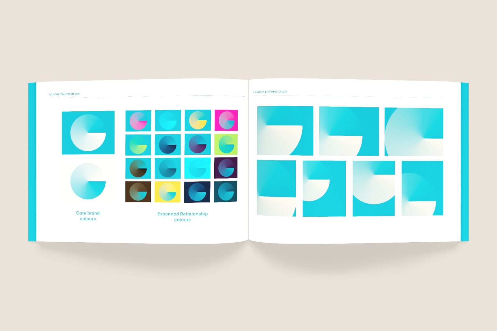
The brand identity was designed to showcase a forward-moving brand while maintaining pride in its heritage. Retaining the existing type mark and primary teal colour, the emphasis on change is expressed through a new, vibrant visual language. Primarily applied to digital and electronic applications, this visual language complements existing materials while adding more personality to new applications.
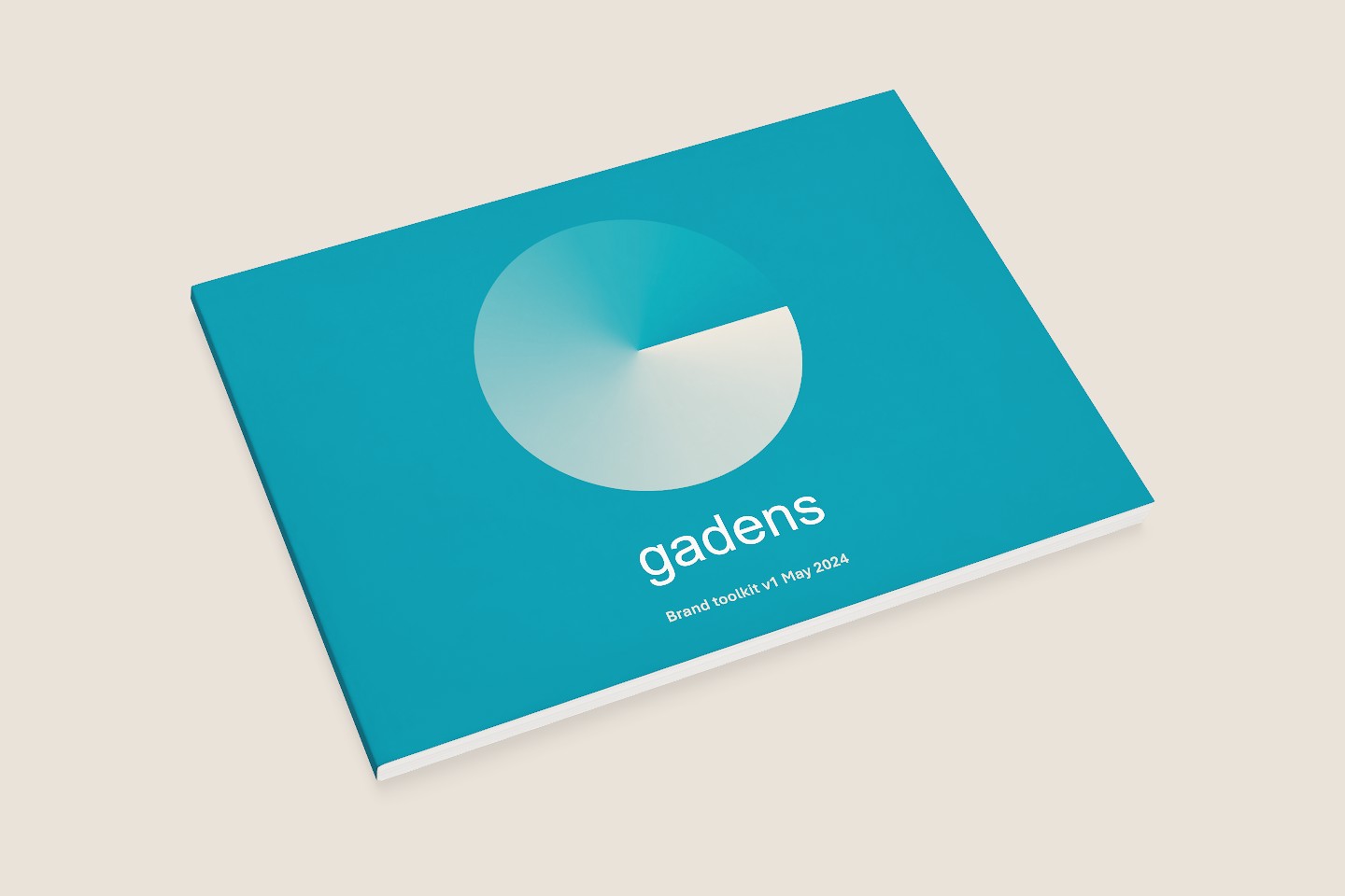
Inspired by a conic gradient, we created a ‘G’ monogram that symbolises the evolution and transformation within Gadens. A new extended colour palette of neutrals, pop colours, and darks with teal at its core completes the visual language. The base colours allow for a conservative refresh, while the bright, contrasting pop colours enable the brand to be more expressive for selected communications or specific clients.
Feedback and results
Truly Deeply was really able to execute the ideas conceptualised and articulate what the firm’s brand stands for. The team was very responsive throughout the project and the turnaround on reiterations of material was impressive.
The refreshed brand has been slowly rolled out internally and externally. The staff in particular have found the expansion of the colour palette useful and the new branding elements have provided a bit more life to the Firm.
”
Pamela Orola, Senior Manager – Clients, Brand and Communications
Gadens