
Insight
Truly Deeply conducted audience research with a cross-section of Spective’s clients. The findings revealed that while the organisation was well-regarded and high-performing, the brand was holding the business back.
The old brand wasn’t exciting, unique, or memorable. IND didn’t represent or celebrate the breadth of services offered or the high regard in which the business was held. Additionally, there were issues with the similarity of the IND name to that of a major formwork company.


Strategy
At the heart of the brand strategy is a new purpose: to refine the future. This purpose emphasises providing forward-thinking leadership, actively shaping the industry landscape, and setting new standards with innovative and sustainable building solutions.
Beyond project completion, Spective aims to create a lasting legacy by making genuine and valuable contributions not only to buildings but also to its people, partners, and community.
The new strategic brand proposition was built from the inside out, capturing the unique culture of the organisation and defining new brand values and beliefs to provide clarity and direction for all employees. The external strategic layers provide a new brand narrative, messaging, personality, and tone of voice to guide and align all marketing and communications.


Naming
After a strategic naming exploration and thorough checks, Spective was chosen. The new name expresses the company’s true identity and purpose to refine the future. Spective represents having a unique point of view and the ability to see things differently.
The new name aligns perfectly with Spective’s problem-solving DNA. Never bound by the status quo, the Spective team always questions, explores and pushes for better solutions.

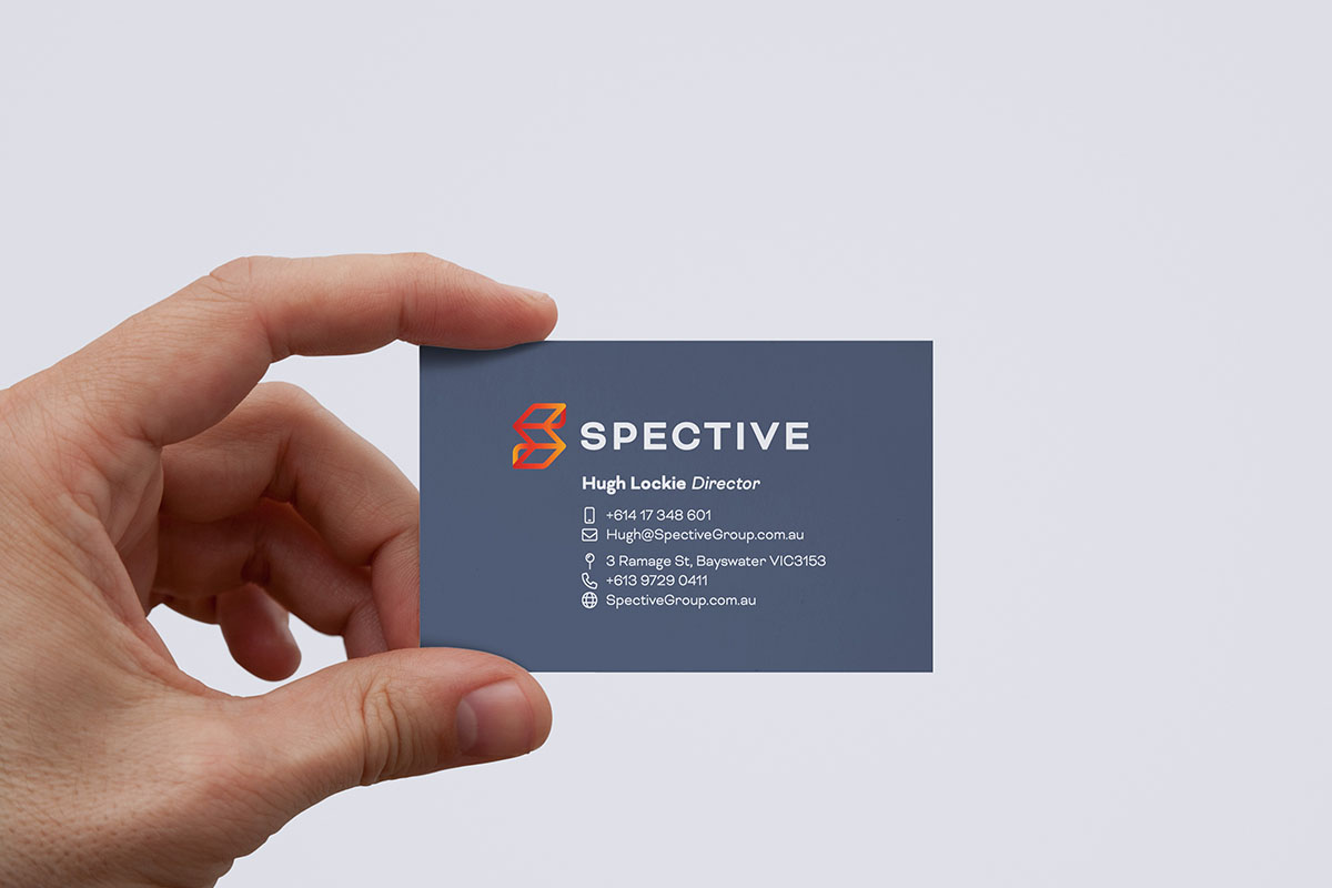
Design
The striking new logo and visual identity embody who Spective is and what it provides. The Spective icon is based on a beautiful three-dimensional ‘S’ from Spective, representing structural genius and a drive to solve problems through design.
This is combined with a modern, bold font and a colour palette that is confident, elegant, and precisely tuned, much like its products and services.

Deliverables
Truly Deeply provided Spective with a brand audit, market review, audience research, brand strategy, name development, brand identity design, website design, collateral design, copy writing, apparel design, vehicle livery, and event consultation.

Feedback & Results
We were a business without internal branding or marketing expertise. Michael was pragmatic and easy to work with and managed to bring the team along with the strategic process in a manner that was rewarding and enjoyable. We are ecstatic with the result of the branding from Michael, Derek, and the Truly Deeply team. It suits us and the brand.
Our clients are already all talking about the brand and how it's positively shifting perceptions of us. Internally, people are really excited. We have long-term employees feeling invigorated about the future and proud of who they work for.
Hugh Lockie, Managing Director
Spective

