Insight
A change in ownership and a bold new vision created the opportunity to signal a genuine fresh start for clients and employees alike. The business needed a brand that matched its ambition and could carry a compelling new direction both externally and internally.
Strategy
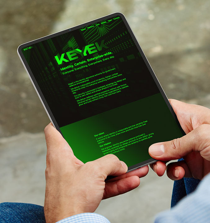
Working closely with the leadership team, we aligned the business and brand around a clear new vision: a world where identity is indisputable, and that certainty frees everyone to do more, share more and build more.
Strategy
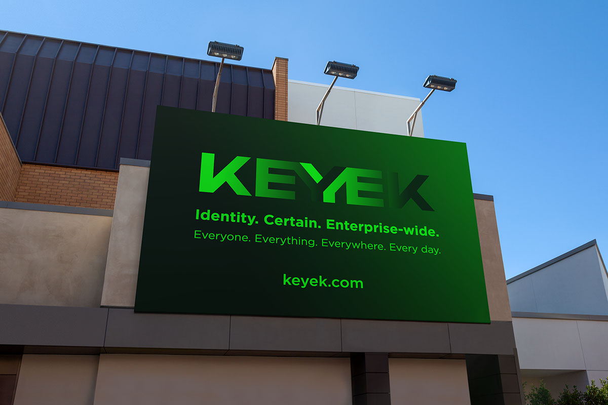
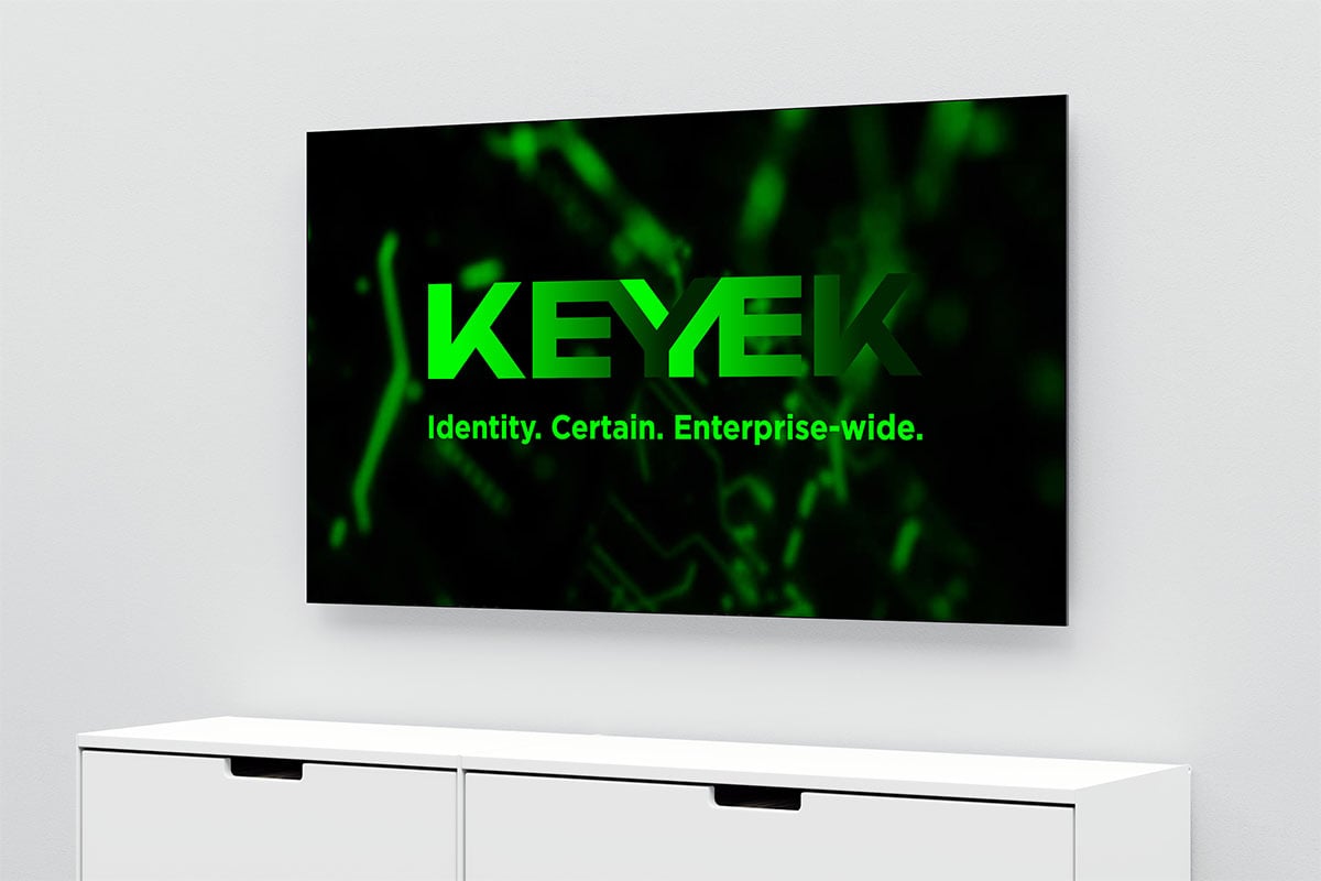
The brand promise; Identity. Certain. Enterprise-wide is a powerful anchor for a complete brand strategy spanning vision, mission, values, beliefs, brand story, messaging and personality. We also simplified the brand architecture, consolidating a suite of product brands into one unified, authoritative identity.
Naming
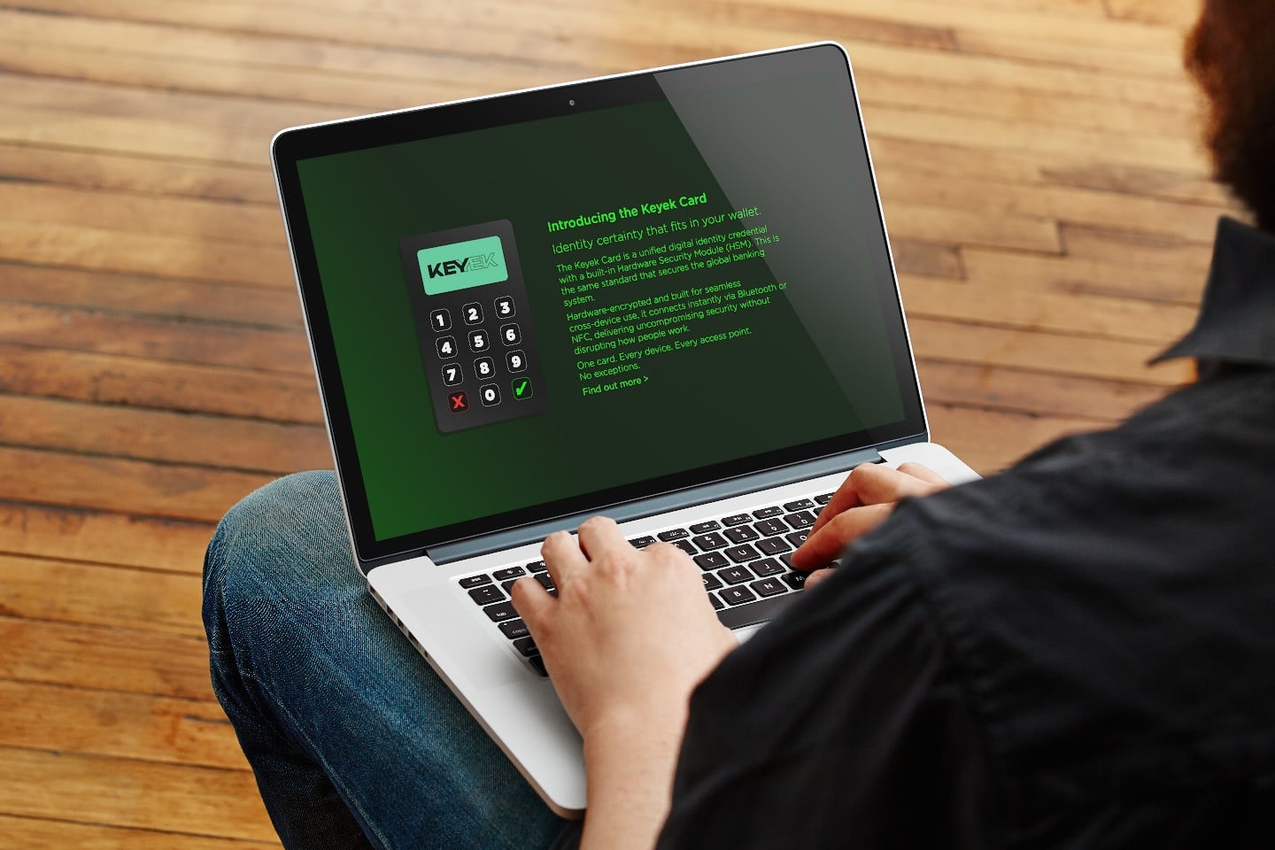
Keyek is a created palindrome built around the word ‘key’, the universal symbol of access, authentication and security, placing the brand directly in its category with immediate legibility for enterprise technology buyers.
At five letters, it is compact, visually distinctive and phonetically clean. Its palindromic structure adds an intellectual dimension fitting for a platform that proves identity is the same entity verified from every direction. Embedded at its centre is ‘eye’, reinforcing the brand’s role in seeing what is often unseen and protecting identity at every layer.
We also partnered with IP legal professionals to conduct comprehensive trademark searches and guide the name through registration.
Design
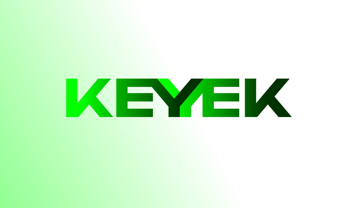
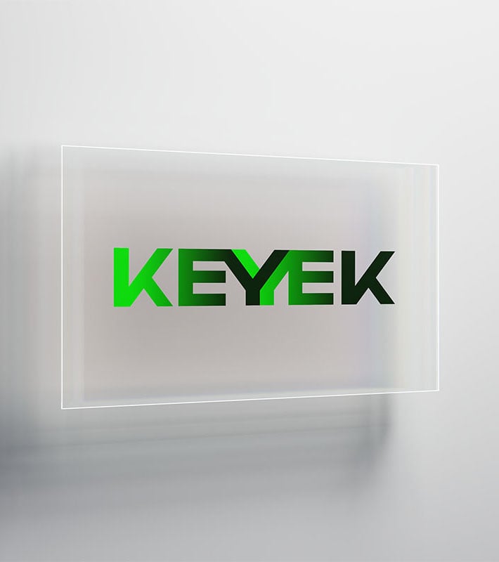
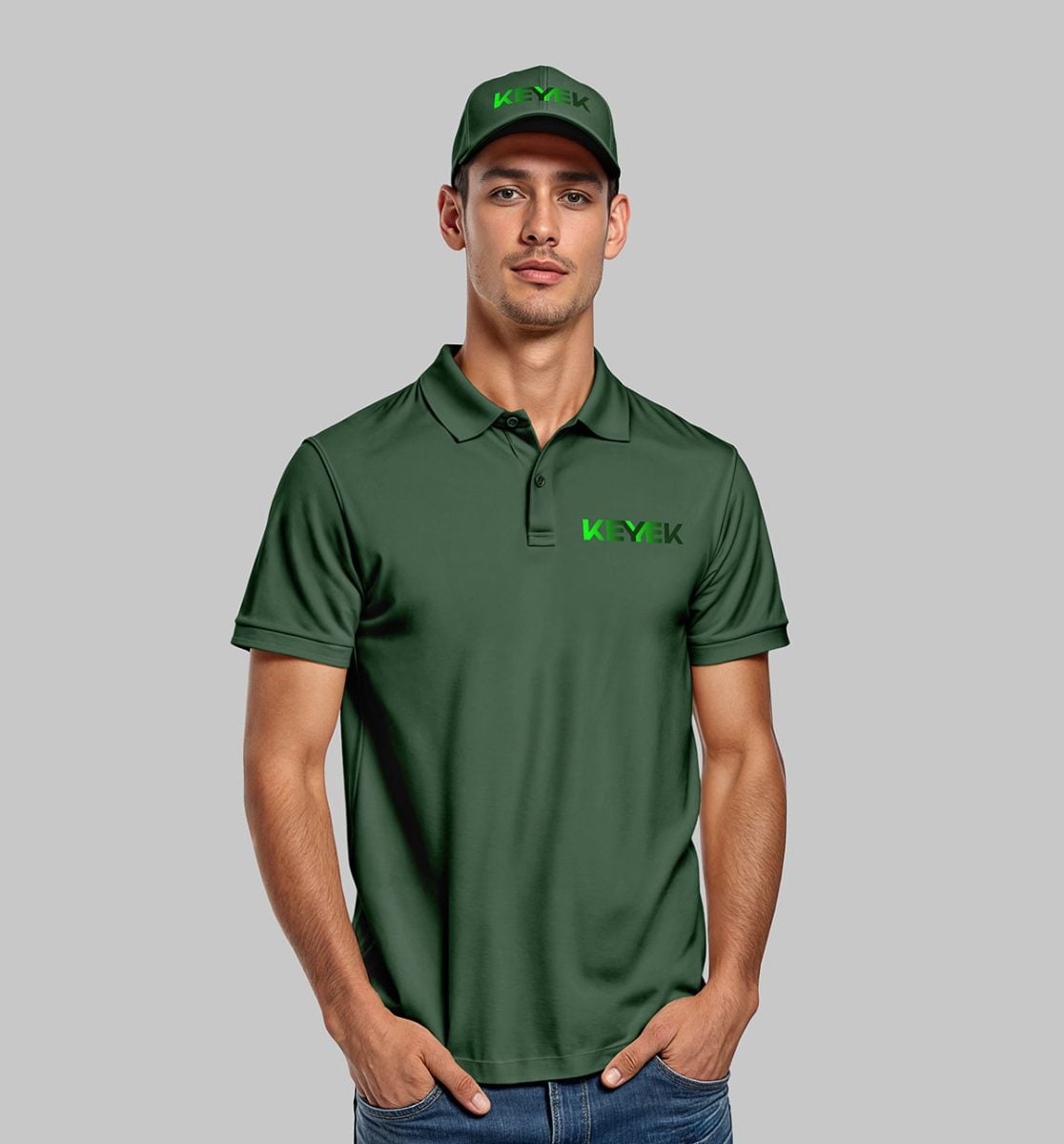
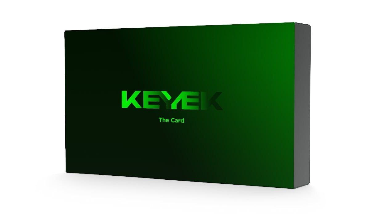
The identity is expressed as a strong, bold custom wordmark that brings the palindromic name to life.
Opening and closing with exaggerated, distinctive Ks, the letterforms mirror each other in angle and rhythm, reflecting the parallel and reflective nature of the technology itself. At the centre, the Y features a multilayered, three-dimensional element and a gradient that illuminates the word KEY within the name, nodding to the dual-key nature of the platform.
The colour palette is digital first, drawing on the CRT console heritage of computing, with an RGB lime as the hero colour that signals military-grade technical precision.
Testimonial
The branding exceeded my expectations and the process was smooth and methodical.
Having worked with many creative agencies in the past, I expected constant realignment along the way, time frames to be blown, and the process to be 'hard work.'
I was completely blown away how Michael and Derek just seemed to 'get it'. Our technology is not simple, yet Truly Deeply found a way to quickly understand it, re-position it, and developed a brand strategy that nailed the brief on the first attempt.
Michael’s strategic writing and Derek’s creative meshed to produce an outcome that surpassed what I thought would be possible.
Truly Deeply were not afraid to challenge our thinking, debate our assumptions, and articulated the brand positioning in a way that allows us to be more effective in customer conversations.
One of Directors commented that he has been through several rebrands at other companies and that was the best brand strategy and creative work he has seen.
I’d highly recommend the Truly Deeply team to any organisation that needs help in getting more value and impact from their brand.
Charles Agee
CEO, Keyek