Insight
Our Brand and Market Review reflected back what clients had already sensed. Maddocks is genuinely different, and genuinely valued – they just weren’t showing it as clearly as they could have.

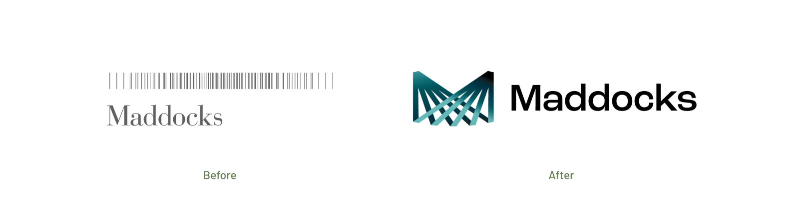
For more than twenty years, the Maddocks ‘barcode’ had served the firm well. But expectations move. Few stakeholders, internal or external, could explain what the mark meant. Its intricate construction limited flexibility and created persistent application issues, and it no longer held its own in a category that had sharpened around it. Meanwhile, the way clients buy and experience legal services had changed dramatically: digital-first, always on, and unforgiving of an identity built for print.
A firm this modern needed an identity to match.

Strategy
Through extensive consultation across the firm, we aligned the new business strategy and vision behind a single, clear brand proposition.
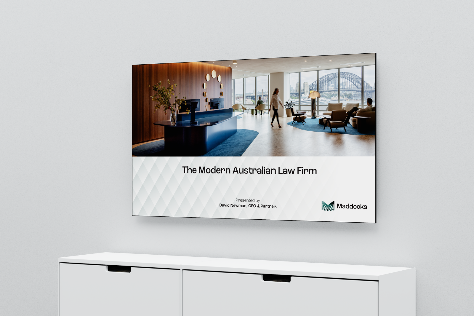
‘The modern Australian law firm’ stayed at the heart of the brand, but it now carries real meaning. A new brand story, messaging framework and personality bring together the firm’s distinctive culture, its value and service mindset, and its ambition to reshape how legal services are delivered.
Design
The new identity is modern, trusted and collaborative: everything Maddocks is, and everything it intends to be.
Rather than discard two decades of equity, we evolved it. The lines of the old barcode resolve into a new M monogram, evenly connected, integrated and balanced, expressing how every part of the firm works as one. The form also reads as the gnomon of a sundial, the marker that tracks time and progress, connecting today with tomorrow. Stewardship and momentum in a single mark.



Keeping a connection to the past, the typography and colour palette remain the same, but with the addition of a new visual language graphics that resonates with the new brand mark without aping it. A repeated diamond pattern uses gradients to create movement and depth. It looks like scale armour and quilted leather at the same time, expressing ideas of strength and protection as well as security and a human touch. With dark and light versions, it a flexible easy to use system.
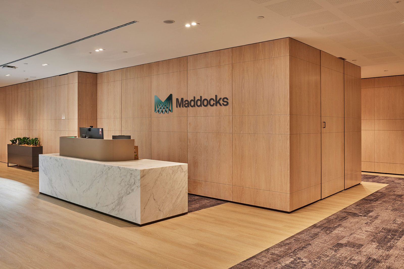
Our new logo signifies a new chapter for Maddocks and is a distinctive and unique symbol of quality, confidence and trusted knowledge. Maddocks is a firm with specialist teams, deep sector expertise, and an intimate understanding of Australia’s commercial, government, and regulatory landscapes, known for solving complex, high‑stakes challenges. This move reinforces our strengthened commitment to delivering exceptional outcomes for our clients, investing in our people and making a positive difference in our communities.
”
Paul Woods, CEO
Maddocks