
Gelati Sky is a boutique, premium gelati range. The story of Gelati Sky has a strong personality driven by Gelati Sky founder Paul Scalisi’s memories of growing up in Rome, eating gelati – ‘a world where every moment seemed frozen in an amazing sensory assault and every cloud in the sky made you feel it was about to rain gelato’.
We were looking for something that was strikingly unique, represented his story and would create conversation. The communication platform of ‘it’s what dreams taste like’ was derived out of our brand strategy work for Gelati Sky.
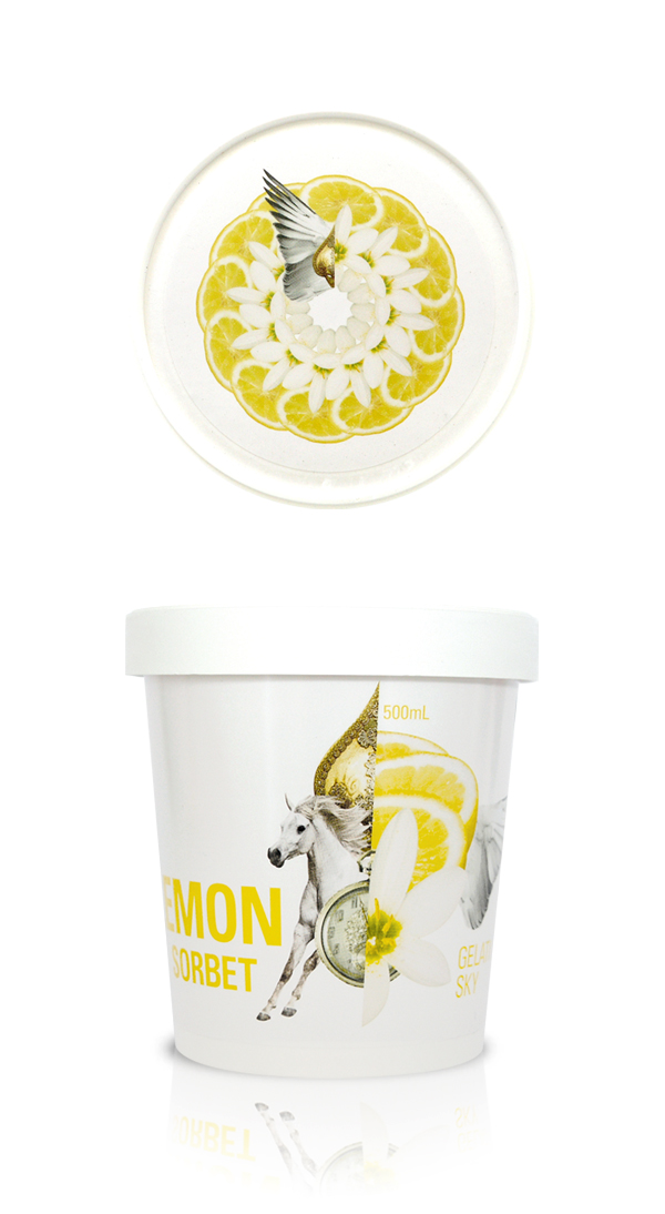
The goal was to express these feelings through the package and the tastes through the flavors. The concept that we came up with was born out of these ideas. We combined the imagery of Italy with objects that looked like the flavor to create a unique, organic and scrumptious shape for each flavor. The packaging looks like it is part of memories and dreams from Italy.
Want to know how we could package-up your brand for growth?
Gelati Sky started as a boutique Gelati range servicing restaurants and specialist food shops. The packaging was the strongest step to building a brand consumer could connect with. As small ultra premium brand, the package needed to take on a more delicate personality than the bigger, more established companies. The package needed to not only reflect the personality and story but also to look different while still maintaining premium feel. The taste of the Gelati is simply amazing and we knew that if we developed a rich, beautiful label, one that would get buyers and customers excited it would be very successful.
“Every presentation we have done when I pull the containers out of the box the first word is WOW! Then they taste the product and they say WOW again! I think we got a winner.”
Paul Scalisi
Managing Director & Gelati Chef
Gelati Sky
Client: Gelati Sky
Brand identity, brand strategy and packaging for retail gelati brand Gelati Sky.


FREE TRIAL
Obligation Free – One Hour – Brand Diagnostic Session
- Clarify your critical brand components; Product/service expertise, Core customer, Competitors & Compelling point of difference.
- Identify your current brand challenges and opportunities.
- Chart the best way to overcoming those challenges / capture the business value within those opportunities.
Pretty amazing… The way the packaging doesn’t use packshot in an ordinary way, replacing it with magical and psychodelic imagery. But lets be honest, you don’t buy ice cream because they contain peanuts or are known for any other nutritional reason. you buy them because they’re supposed to make you feel better…
This packaging certainly communicates that.
[…] peers at Brand Union. In 2008 we began working with local Gelati Maestro Paul Scalisi to develop a brand strategy, brand story, visual identity and packaging for his premium, Italian inspired gelati brand; Gelati […]
Nice work, good design with an idea in there – would make great 48 sheet posters.
K
Gorgeous package design guys! Love your work 🙂 Smiles for miles, Skye