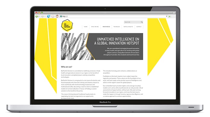
Overview
BioPacific Partners are expert advisors and brokers of new deals between innovators in food, health and agriculture sectors with market-facing parties (generally large corporations). This is a new service offering that builds on the founders’ relationships and reputation established through their previous venture fund BioPacific Ventures.
The Challenge
We needed to create a standout brand that would appeal and demonstrate value to both innovators as well as large corporates. The brand also needed to reflect a new way of realising innovation for companies but also a trusted partner that both innovators and corporations could rely on to build fruitful partnerships.

Insight
Australia and New Zealand both have a tradition of world-class innovation in food, health and agriculture but this is largely overlooked, misunderstood or untapped by multinationals that are traditionally based in North America or Western Europe. BioPacific Partners has a unique opportunity to represent this massive potential for local innovators, corporations and the world.
BioPacific Partners also have ambition to grow in other untapped innovation areas, so we also needed to ensure the brand did not over emphasise an Australian or New Zealand image in the brand.

Strategy
At the heart of the brand positioning for BioPacific Partners is the mantra of ‘unlocking the region’s innovation potential’.
“This is all about more than just connecting innovators with corporate companies to realise their inventions. The brand’s DNA positions the company as the thought leaders in food, health and agriculture innovation, bringing forward meaningful innovation and exploring new models of commercialisation and redefining ventures in the life sciences,” says Michael Hughes, Partner and Strategy Director, Truly Deeply.
Design Solution
The design is inspired by the Carbon Ring that represents the building blocks of life as well the idea of a diamond in the rough. The brandmark’s striking icon highlights how BioPacific Partners connects and builds partnerships between innovators and investors to bring innovation to life.
The bright yellow was chosen as the brand’s primary colour to highlight the company’s optimistic and fresh approach that is in contrast to the typical corporate blues and muted colours that dominate the sector.
A bold but contemporary and friendly font was chosen to highlight the brand’s theme of strong partnership to both innovators and investors.

How we helped Bio Pacific Partners
Truly Deeply provided a market review and decode, brand strategy, brand identity design, stationery, website design, brochure and collateral design.