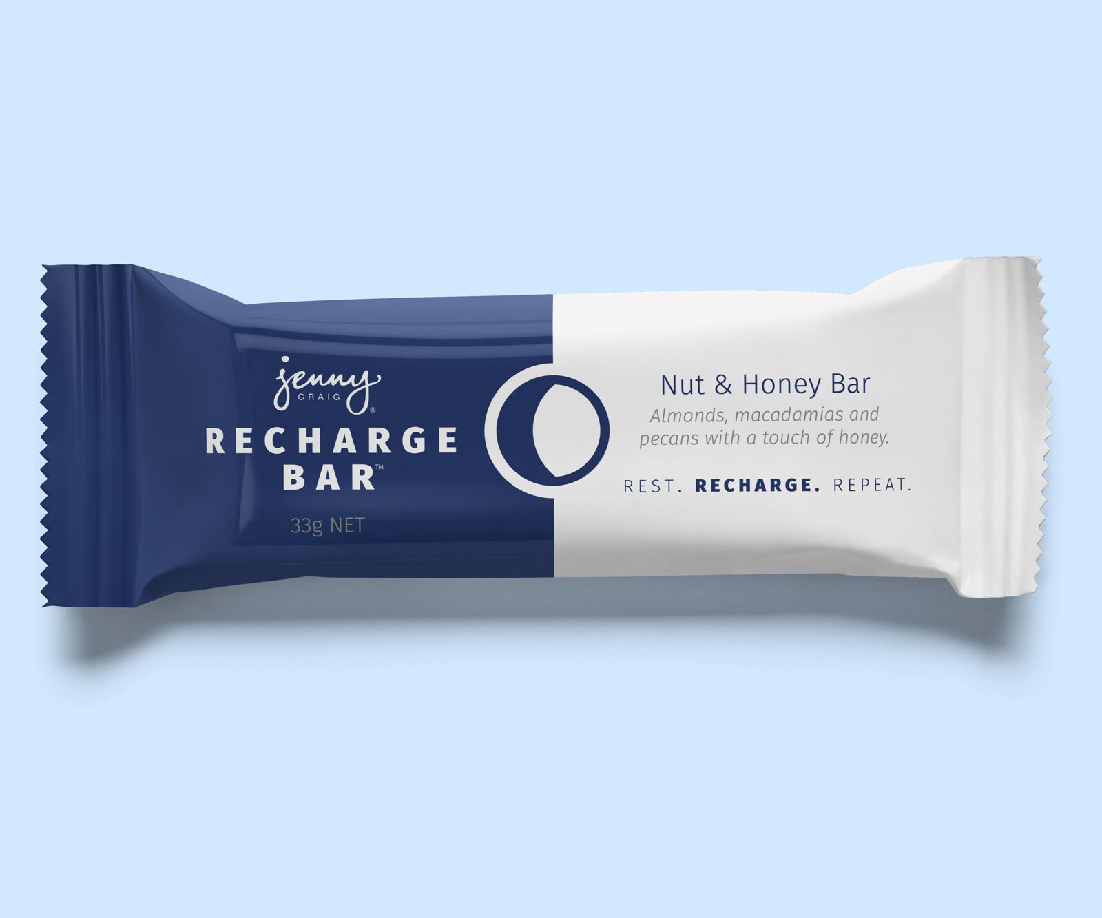

In line with their new intermittent fasting program, Max Up, Jenny Craig introduced their new Recharge Bars.
The bars are specially formulated to be high in fat and have been designed to support a new intermittent fasting routine. The bars and box have an updated version of the Jenny Craig packaging highlighting the on-off, day-night cyclical nature of fasting. The simpler design included matt, textures and foil finishes to achieve a premium feel.


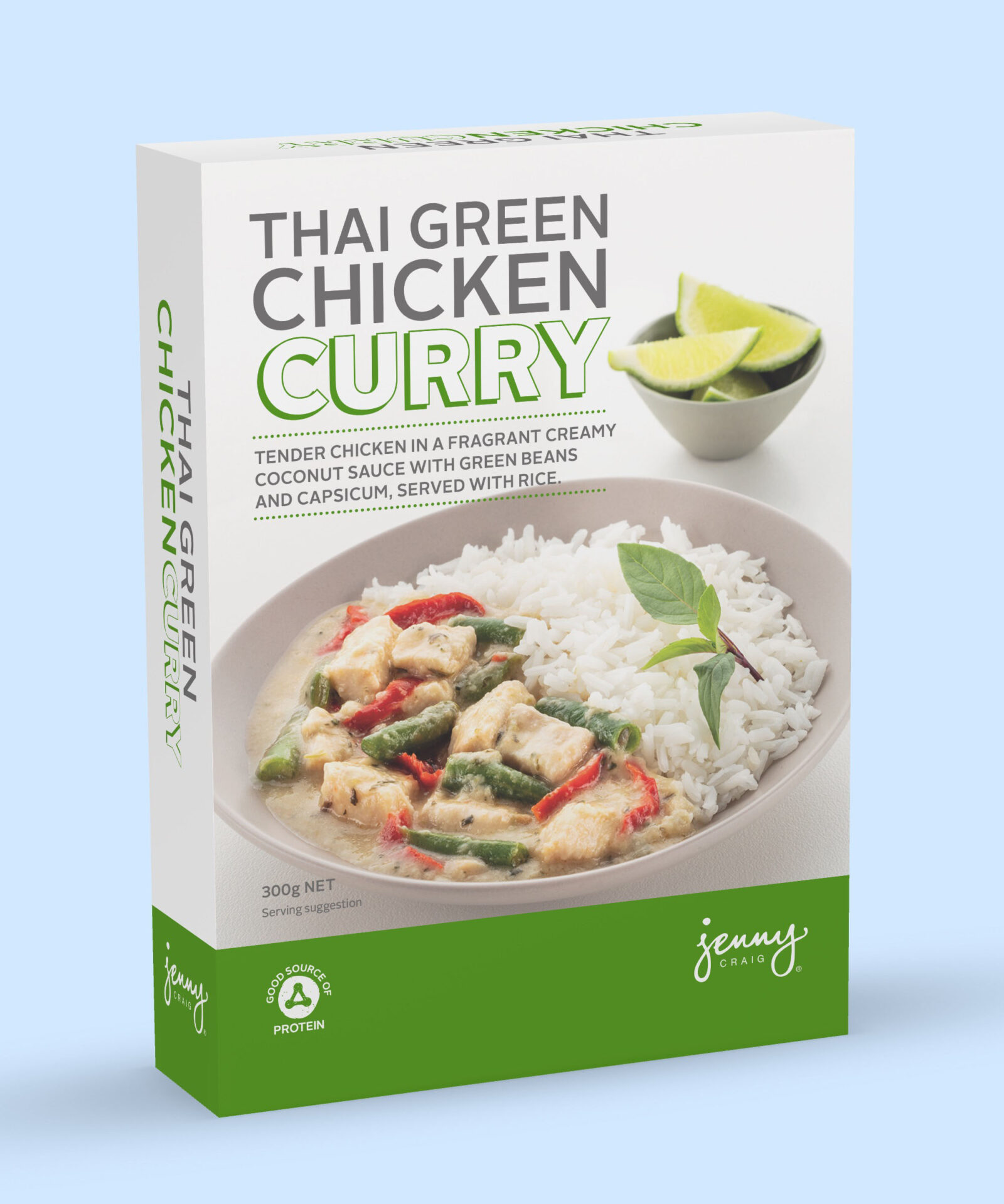
Carefully formulated by our friends the Foodies in Jenny Craig the constantly updating range of dinners are a cornerstone of the weight loss program.
Designed around a simple but flexible design system, it accommodates varying box sizes, name lengths and food types. The system was created to be easy to roll out and has the possibility for customisation. Through reviews, the design system has been simplified and streamlined so while slowly modernising everything looks and feels part of like the same family.
In keeping with Jenny Craig’s values, the food is never over-styled. While we work hard to ensure the food looks good, the styling is a genuine representation of what customers will get when they unpack it.
Prepared and accompanied by Free Food allowed on the program, all food is in keeping with the recommended potion sizes. None of the food is fake, coloured, glazed or reconstituted. The product we photograph is as customers will experience it. It’s important that there isn’t a big disconnect between the packs and the food.


By changing the key spot colour on the packaging, Jenny Craig can keep the range looking fresh and interesting.
We continue to explore new colour ranges in line with the seasons, trends and key product flavours. For example, the individual breakfast cereals (pictured above).
It’s really important that Jenny Craig’s packaging looks like a modern, premium supermarket product. Jenny customers must be proud of the products and happy to use them at home or at work.


The menu items come from many different partners and the packaging is printed by a further array of different suppliers.
To manage this, the design was created to reproduce favourably across a wide array of printing techniques, abilities and substrates. The packaging range includes boxes, film envelopes, cartons and tubs.

Sometimes the product only allows for very simple production qualities as with the Multivitamin.
Even then, the distinctive visual language works to keep it looking on brand and part of the Jenny Craig range.