
Mirvac is a property developer with a number of large residential community development projects in their portfolio. Mirvac had purchased a substantial development site in the well-established municipality of Knox, in Melbourne’s east.
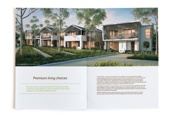
Located on the former Austral Bricks site in Wantirna South, Mirvac’s masterplan was for a new community offering a range of premium living choices set within a contemporary residential environment. As they completed the final stages of the nearby Waverly Park development, Mirvac was keen to remain active in this growth corridor and continue to build on their reputation for offering a contemporary, low density home and lifestyle option for residents in the eastern suburbs.
Challenge
Our brief was to work closely with the Mirvac development team to build a compelling place proposition that clarified and inspired a vision for the place in particular, to develop a place name and brand identity on which to build a pre-sales and sales marketing strategy.
As a new development we needed to understand the market and identify a place proposition that would resonate with a need, match Mirvac’s demonstrated capabilities and form the platform for an effective marketing campaign.
Insight
Located in a strong growth corridor in the sought after eastern suburbs of Melbourne, the surrounding areas were well established with 1970s and 1980s homes occupying good sized blocks. Characterised by ‘comfortable suburban living’, we saw a powerful position for Mirvac to create an oasis of contemporary living within a market that aspired to modern architecture, design and the lifestyle those things afforded.
Strategy
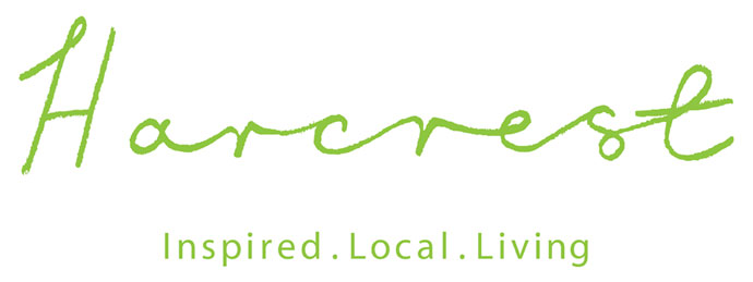
The brand strategy was grounded by the positioning of the new community as aspirational modern living. The place proposition was captured in the tagline ‘Inspired. Local. Living’ which re-enforced Mirvac’s uncompromising approach to quality and created a strongly differentiated and aspirational sense of the place.
Design Solution
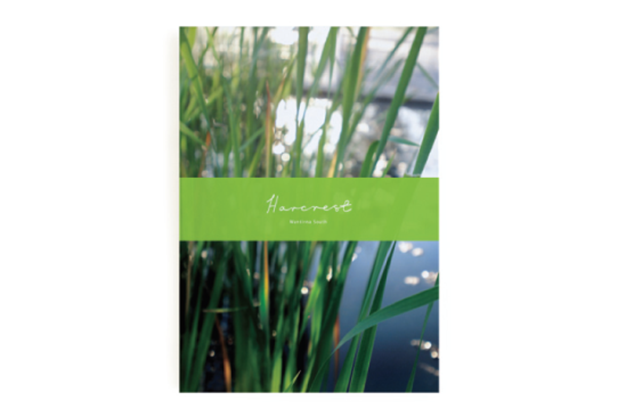
Building on the place proposition, we developed a brand name, brand identity and complete brand communications rollout. The visual language of the brand intentionally reflected the cues of interior design magazines and brands.
From the handwritten place mark to the colour palette, photographic style and generous use of clear space, the place brand identity design was all about the intersection of personal and aspirational design.
Deliverables
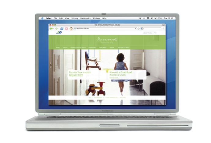
The project required a place brand strategy, place name, place brand identity and marketing campaign. The roll-out included, stationery, web site, marketing brochure, sales office fit out, local newspaper advertising and hoarding designs as well as integrated marketing campaign concepts from pre-sale through to launch.
Results
The outcome of our work for Harcrest was reflected by exceptional pre-sales registrations received through the project web site. The initial launch of the project was through highly visible site hoarding, local newspaper ads, web site and downloadable pdf brochures. Pre-sale registrations of interest exceeded expectations with more than 1,000 potential buyers registering the details to attend the launch, information sessions and receive follow-up communication from the sales team.