Background
Established in 2004 as a national private training organisation, Selmar provides a range of specialised, business centric and flexible courses in early childhood education, aged care, business upskilling, training and assessment. Selmar offers short courses, certificates, diplomas and advanced diplomas on-campus, as well as customised in-workplace training.
Challenge
With the massive growth of the early education and aged care sectors, Selmar was experiencing increased competition from both large generalist tertiary institutions as well as smaller specialist educators. Selmar needed to differentiate, emphasise their experience, expertise and unique approach that makes them the preferred training provider for the early education and aged care sectors.
Insight
The motivation for studying to be an early childhood educator or an aged care professional is very different. The employers in each sector also have different needs. Selmar understands this but with a monolithic brand approach, they were struggling to appeal to the diverse audience needs and reflect their sector expertise. Selmar required a new brand architecture, strategy and visual language that would provide a strong connecting brand thread with the flexibility to tailor relevant brand messaging and emphasise their expertise in each sector to each audience.

Strategy
Truly Deeply worked with Selmar’s founder and leadership team to craft a new brand strategy. The brand now has a renewed focus on developing transformational learning excellence and is passionate about infusing care beyond compliance in everything they do.
We created a new brand architecture system that has a family of three brands that are tailored to each sector, positioning Selmar as the industry expert.
The three brands share a common ethos towards education and training but have been designed to connect with the different needs and aspirations of students, employers and those looking to upskill or become trainers and assessors. Each brand now has the ability to build a stronger and deeper connection with their audience and Selmar can effectively show their expertise across diverse industry sectors.
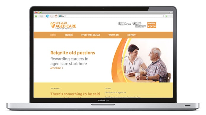
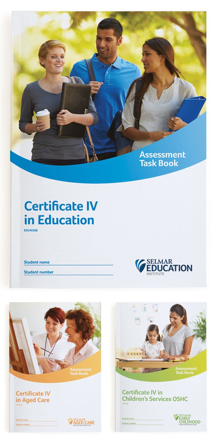
The brands were also named to align to their relevant sector. The three brands are Selmar Aged Care, Selmar Early Childhood and Selmar Education. Early childhood was chosen over childcare as this aligns with the direction the sector is taking in terms of ‘industry language’ and the name of the courses.
Design Solution
The Selmar brands and their identities have been fundamentally reinvigorated to better represent the new brand architecture and strategy. The original shield icon was kept, while a more vibrant secondary visual language, distinct colour palettes and tailored secondary fonts for each of the three brands was developed. Green was selected for Selmar Early Childhood to represent growth, health and nurturing. Selmar Aged Care is orange to represent warmth, positivity and enrichment. Selmar Education keeps the original blue brand colour to retain the equity that existed within the brand. The new visual language is vibrant, eye catching and memorable with a tailored energy swoosh and photographic style for each industry specialist brand that reflects the different audiences in an optimistic and positive way.
Deliverables
Truly Deeply worked with Selmar to completely transform the brand from the inside as well as all external touch-points. This included a brand audit, market decode, customer journey mapping, brand strategy, brand architecture, naming, brand identity design, website design, photography, collateral and promotions, advertising, signage, environmental graphics, culturalisation and employee engagement.