
Overview
Soulful Soup is a new food service business producing high quality soups from stock for service in cafes and restaurants. The brainchild of local food guru Simon Michelangeli, the traditional recipes, quality of ingredients and integrity of the cooking process of Soulful Soup combine to produce a depth and richness of flavour previously unavailable for food service customers.

The challenge
As a start-up business with a long list of potential customers to visit and the winter soup season approaching, Soulful Soup required a brand identity, suite of sales/marketing materials and food service label templates to capture the evocative flavours of their product, and they needed us to get it right first hit.


Want to know how we can re-package your brand for growth?
Insight
The more time we spent with Simon and his soups, the more we realized the ingredients were what made all the difference. The amazing flavour profiles of the soups began with the stock, prepared the way Simon’s family had made stock for generations. With the rich stock providing the base, the next layer of flavour was provided by the quality and quantity of the ingredients from roasted vegetables to slow cooked meats and top shelf herbs and spices. We were left with the indelible impression that the ingredients truly were the heroes of the brand.
The design solution
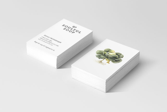
Beginning with the Soulful Soup brand mark, we developed an identity that combined a contemporary feel with a sense of tradition to reflect both the modern style of business that is Simon’s signature with the traditional, home-cooked approach of the soup recipe and manufacture process. The clean black line-work and slab serif font of the brand visual language provided the contemporary flavour of the brand mark, which contrasted with the symbol designed to represent both a heart shape and a ladle, reflecting the brand’s passion for home cooked soups.
The brand mark was supported by beautiful, water colour and ink, old school food illustrations that heroed the ingredients of the soup. The secondary type design style combined serif italic headlines with sanserif body fonts which were inspired by cook books.
The end result is a visual identity as rich and flavoursome as the Soulful Soups themselves.

How we helped Soulful Soup
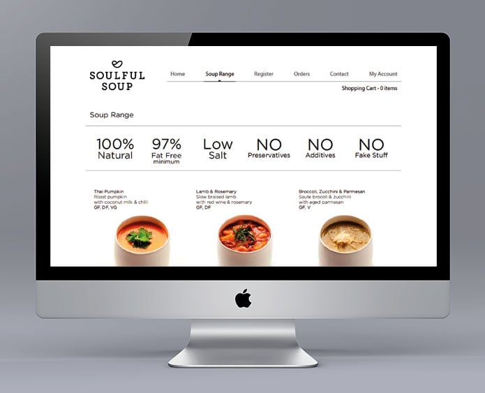
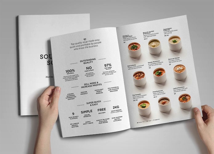
We worked with Soulful Soup to create their brand identity, business stationery, digital presence and sales collateral along with food service label design.


FREE TRIAL
Obligation Free – One Hour – Brand Diagnostic Session
- Clarify your critical brand components; Product/service expertise, Core customer, Competitors & Compelling point of difference.
- Identify your current brand challenges and opportunities.
- Chart the best way to overcoming those challenges / capture the business value within those opportunities.