
The Cradle is a best of breed, 5 star luxury hospital dedicated to mothers giving birth. As a specialist maternity hospital The Cradle automatically carries strong clinical associations, there-for the role of the visual identity as to clearly differentiate The Cradle as the premium, 5 star hospitality brand within its marketplace.
The visual language from brandmark to photographic style, from design layout and grids to production techniques is informed by the brand identity visual cues of premium hotels and health spas. These rich visual cues are aimed at connecting with the premium ‘parents-to-be’ market who wish to have access to the highest possible standard of clinical care, be pampered in luxury during birth recovery, and are happy and willing to pay a price premium for that.
As a brand, The Cradle is unique. It is a brand that embraces the joys of pregnancy and celebrates the wonder of childbirth. It also recognises the vulnerability of patients, their fear of the unknown, and their need for reassurance. The task of the brand communication for Cradle was to signal something fresh to the market, to reinforce the premium hospitality positioning and at the same time create immediate trust and belief, with a nuturing, personal feel.
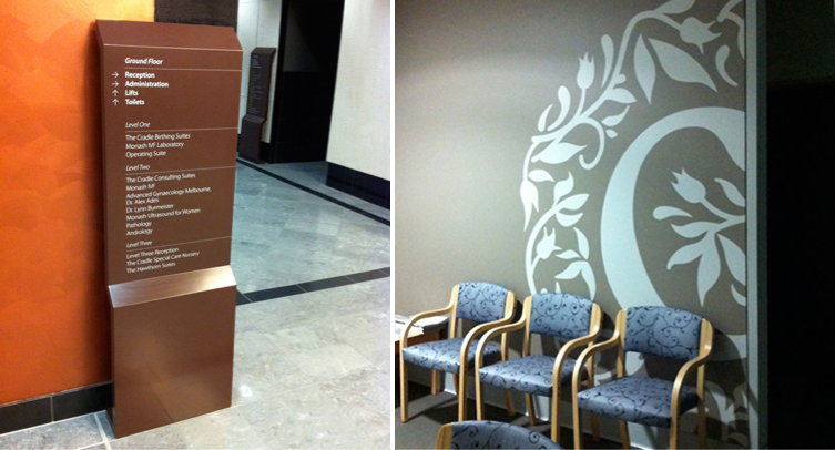
The Cradle brand mark reflects the visual cues and aesthetics of the premium hospitality market, whilst the type face is both elegant and clinical and confident. The circular shape of the mark provides a sense of nurturing, with the space inside the ‘C’ reflecting a sense of the womb. The flowering gum leaves and branches hark back to the timeless nursery rhyme ‘rock-a-by baby in the tree tops’. The secondary visual language, colour palette and photographic style are all crafted to reflect the feel of a premium, boutique hospitality experience. The new identity was implemented across stationery, signage, brochure and marketing collateral, advertising templates, brand voice and website.


“The vision of the Cradle and how we wanted it to be became part of us. The problem was how to communicate it to the world. My words and presentations only go so far. Truly Deeply created the words and the visual images to spread the message to the world. When my voice trembled with emotion as I read aloud the words they had created, I knew the message was right. The consistency of words and visual language has been crucial in conveying our message to a new audience.”
Anthony Weeks
Director of Cradle Maternity Services
[…] The Cradle Brand Identity (trulydeeply.com.au) […]