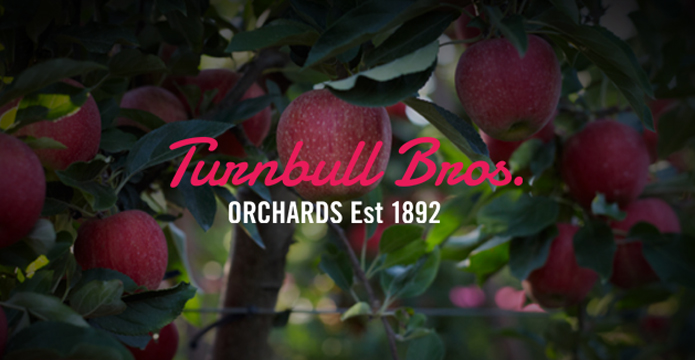
Steeped in more than 100 years of heritage, Turnbull Brothers Orchards is a compelling story of our family’s dedication to the land and a passion to deliver Australia’s finest fruit. An approach that has us sensitively and intelligently working with nature in a way that our fruit is gifted with the best of what nature can offer.
“Our aim from this rebrand was to hit eight to 10 premium grocers – those that also stock high-end retail products such as Maggie Beer. After only three days at the market, we’re already 50% there,” says Phil Turnbull, Managing Director of Turnbull Bros. Orchards.


To view the new website click here.
Turnbull Bros. proudly embraces a traditional artisan approach to growing, picking and distributing fruit, using many techniques the family did more than a century ago. Yet many consumers are unaware of this journey from the farm to the plate. Minimising the degrees of separation, Turnbull Bros. eliminates unnecessary handling to maximise freshness and deliver the finest quality hand-picked apples, pears, cherries, nectarines and peaches every time.


So we sought to create an identity and packaging solution that highlights the premium nature of their brand.
“Bringing to life the new brand essence – Nurturing Nature’s Best – the solution needed to speak of location, tradition and family. Through a creative branding process, we defined a strategic direction that demanded a modern, yet premium, interpretation of traditional fruit packaging. This drove the creative to the hero of the rich storytelling drawn from the brand heritage and honest mindset of the Turnbull Bros. Authentic photography balanced with honest brand messaging is a powerful combination and has allowed for a category redefining identity,” said Tim Wood, Lead Designer at Truly Deeply.


Our market evaluation revealed an abundant use of colour – and lots of it – so a key part of the solution was to provide economic packaging that would stand out in wholesale and supply a preferred display in store.
The result is a series of grey-toned cartons with a ‘retro red’ brand mark. On the packaging, a charcoal colour was used to highlight the naturally rich colour of the fruit while the ‘retro red’ is a modern interpretation of the brands heritage and an immediate stand out on the package design.


“Our industry is largely unaware of the value of the branding process but I believe in the influence of a brand and beautiful packaging. “I really enjoyed Truly Deeply’s creative process. It encouraged us to really think about the key elements of the brand and form a solid, clear direction for our future. We knew what we had but we didn’t know how to articulate it. The strategy developed was gold and really focused the project, giving real meaning to entire process,” Turnbull added.
In addition to the cartons and stickers, we created an image library and new website to illustrate the history of Turnbull Bros. Orchards. In 1892, Edward Turnbull and his brother-in-law, Henry Pickworth purchased land in Ardmona in the Goulburn Valley, Victoria. Five generations later, Turnbull Bros. Orchards is renowned for producing. Their deep-rooted family passion for the art of being a quality orchardist provides the authenticity for the marketing of a premium Australian fruit brand.
