25 Killer Custom Typefaces – A Brand Design Asset
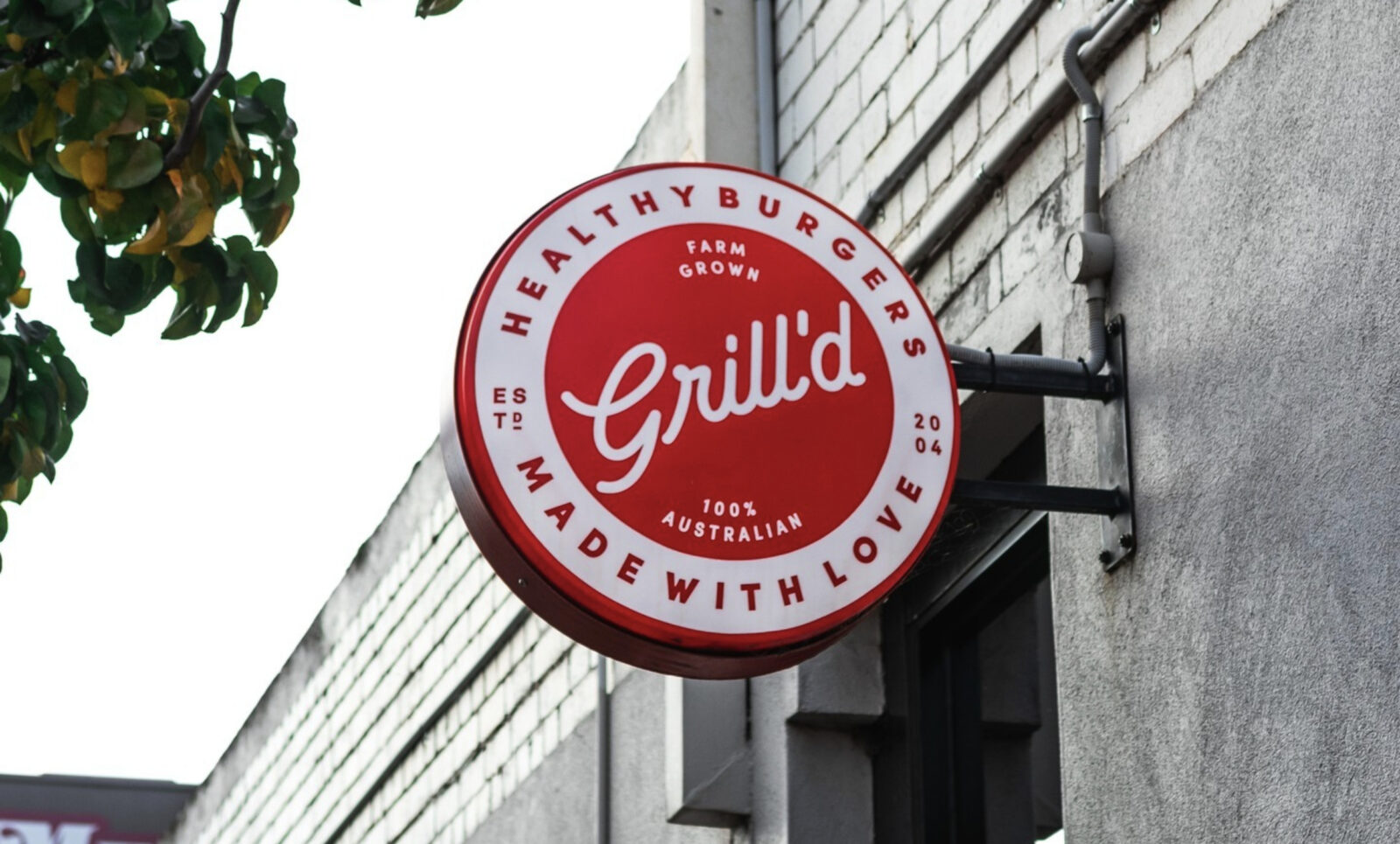
Building Your Brand’s Visual Properties When creating a corporate image for our clients brands, we focus on building unique brand properties that can be leveraged to become brand assets. A brand’s typeface is one of the visual properties we incorporate into the brand design process,…
Read more »