
We love our footy here at Truly Deeply.
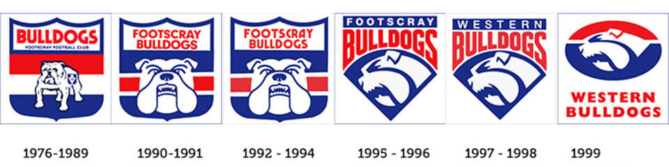
With just the penultimate game to-go our tipping comp has gone down to the wire with some serious mind-games between Em and Simon playing out. And as part of the excitement of Grand Final week, we are marking the Grand Final public holiday (yes, our State Govt. in all it’s vote-buying wisdom has given us a public holiday to watch a parade and get ready for tomorrow’s big game??!!) with an historic tip of the hat to the Swans and Bulldogs branding from the last 40 years. These logo design progressions have been put together by digital producer Ben Newton, and whilst not 100% up-to date, they show the graphic progression of the club brand identities from the 1970’s onward in all their glory. Of particular historical relevance is the moving of the Swans from South Melbourne to Sydney in the 1980’s. The logo designs below show the introduction of the Sydney Harbor Bridge and then the Opera House to culturalise the club in their new home town.
![]()
Dave Ansett
David is the founder of Truly Deeply, a brand agency with 25 years experience working with brands to position them for growth. His deep expertise is in the creation of high engagement brands that attract the attention of their audience and stand out from their competitors. David has extensive experience working with corporate, retail, food & beverage and entrepreneurial clients. Find out more at…
For monthly updates of our thinking, click here to receive our free Brand Newsletter