fix ur **bleep**ing logo.
If I had a dollar for every time a business owner or marketing director has told me their clients and customers don’t care how their branding looks over the years, I’d be writing this article from my private island in the Bahamas. For the whole of my career, the prevailing belief client side was that the only people who really cared about how their ‘logo’ looked was brand identity designers who frankly needed to get a life.
Antisocial brand obsession aside, times have changed when it comes to the care and attention businesses need to give to their brand identities. One of the most interesting and fastest growing consumer trends we’re seeing playing out is consumers calling-out brands for shoddy identity design.
As part of the evolution of ‘brand connectedness’, audiences are becoming more sophisticated in their understanding of all aspects of branding and gaining a heightened expectation of what the brand delivers. These expectations includes the way it behaves as a global citizen, where and how it sources its products, the way it treats (and pays) its staff, and as it runs out; how well their logo is designed.
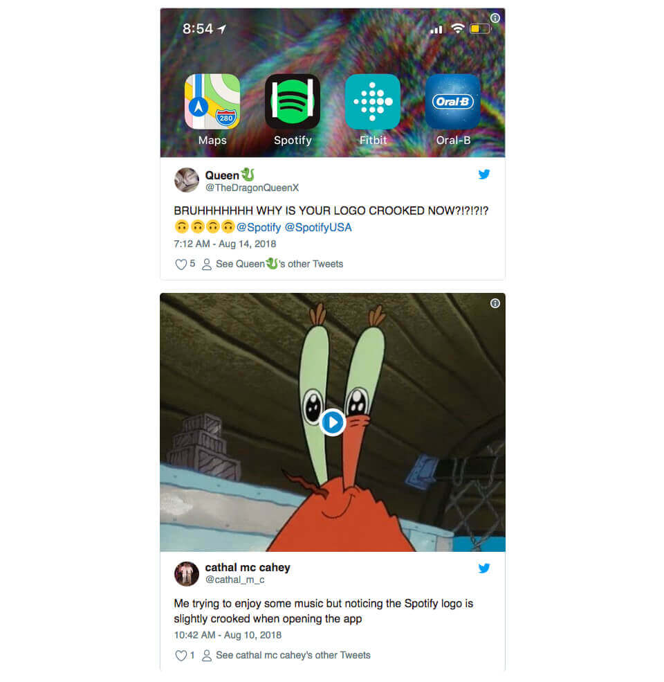
This trend is playing out in the world of social with consumers actively deriding brands who have not paid the right level of attention to the design of their visual language. Spotify is the latest to come under the microscope. A quick search of Twitter, Instagram and Facebook shows alot of people getting hot under the collar about the design of Spotify’s brand mark. One recent post to the company’s community page under the title “fix ur **bleep**ing logo” said;

We work to the iceberg principle with brand feedback, the principle being that if 100 people are getting onto social media to gripe about something, there’s probably another 1000 people who are thinking the same thing but not motivated enough to post it. Some of the other posts on social about the Spotify brand mark include:


At first glance this looks like an amusing sprinkle of tirade until we stop to look at the time, energy and scale of these responses. Are the off-skew lines enough to make a customer change to another music streaming service? Very unlikely. However the golden rule of branding is to do everything you can to align positively with your audience and to address whatever causes dissonance or negative sentiment. If I were Spotify I’d certainly be taking note and investing in a brand identity update. for all businesses it is time to get your brand in order.
But this isn’t just about Spotify. Every business need to get serious about ensuring their brand is in order from top to bottom. If you’re one of those business owners or brand managers who’s always believed your audience wasn’t to fussed about the quality of your brand identity design – it is absolutely time for a rethink.
Dave Ansett
David is the founder of Truly Deeply, a brand agency with 25 years of experience working with brands to position them for growth. His deep expertise is in the creation of high engagement brands that attract the attention of their audience and stand out from their competitors. David has extensive experience working with corporate, retail, food & beverage and entrepreneurial clients. Find out more here
For monthly updates of our thinking, click here to receive our free Brand Newsletter
Pic; Spotify.