
The new brand identity for the U.S. Open fails to impress.
Watching the U.S. Open tennis on the weekend I copped an eyeful of the tournament’s re-branding for the first time. Somehow I’d missed the commentary on the rebrand in the lead-up to the event’s 50th anniversary, so was taken by surprise. Gone was the flaming tennis ball, which has represented the event since 1997, replaced by a contemporary, simplified version. My first impression of the new event branding was ‘disappointingly underwhelming’, a view that I’m afraid hasn’t improved in the 48 hours since.
Event branding is alot like place branding. Unlike creating a brand identity for a corporation, designing a brand mark and identity system for an event is all about capturing the unique sense of spirit it represents. The layers that make-up this sense of ‘event’ include history, location, season, the spirit of the sport itself and the unique flavour of the tournament.
Capturing these layers of feeling is a tough ask, but one achieved each year by Wimbledon and the French Open. Both of these tournaments leverage their heritage and traditions effectively. Interestingly, the Australian Open recently took the same approach as the U.S. Open, rebranding with a simplistic and contemporary new identity system.
As with the U.S. Open, the new branding for the Australian Open stripped away all of the meaning and spirit associated with the tournament as a result of years of building equity and good-will, replacing it with a meaningless, but more importantly a ‘feelingless’ brand identity.

The new U.S. Open brand identity was created by Chermayeff & Geismar & Haviv, a US based agency with a weighty reputation for developing some of the country’s highest profile brands for over 60 years.
CG&H set-out to create a simplified and updated version of the event brand mark to bring the 50-year-old United States Open Tennis Championships into the digital age and give it a more “youthful appeal”.
I always find it interesting when ‘youthful appeal’ is the rationale for giving up a brand’s visual identity heritage. Assuming ‘youth’ are disengaged by tradition and naturally attracted to clean and simple is an overly simplistic rationale. Don’t get me wrong, the new brand identity clearly brings the event into the 21st century, however the over-simplistic and functional brand mark for me has entirely lost the spirit of tennis and of the uniquely, American grand slam event itself.
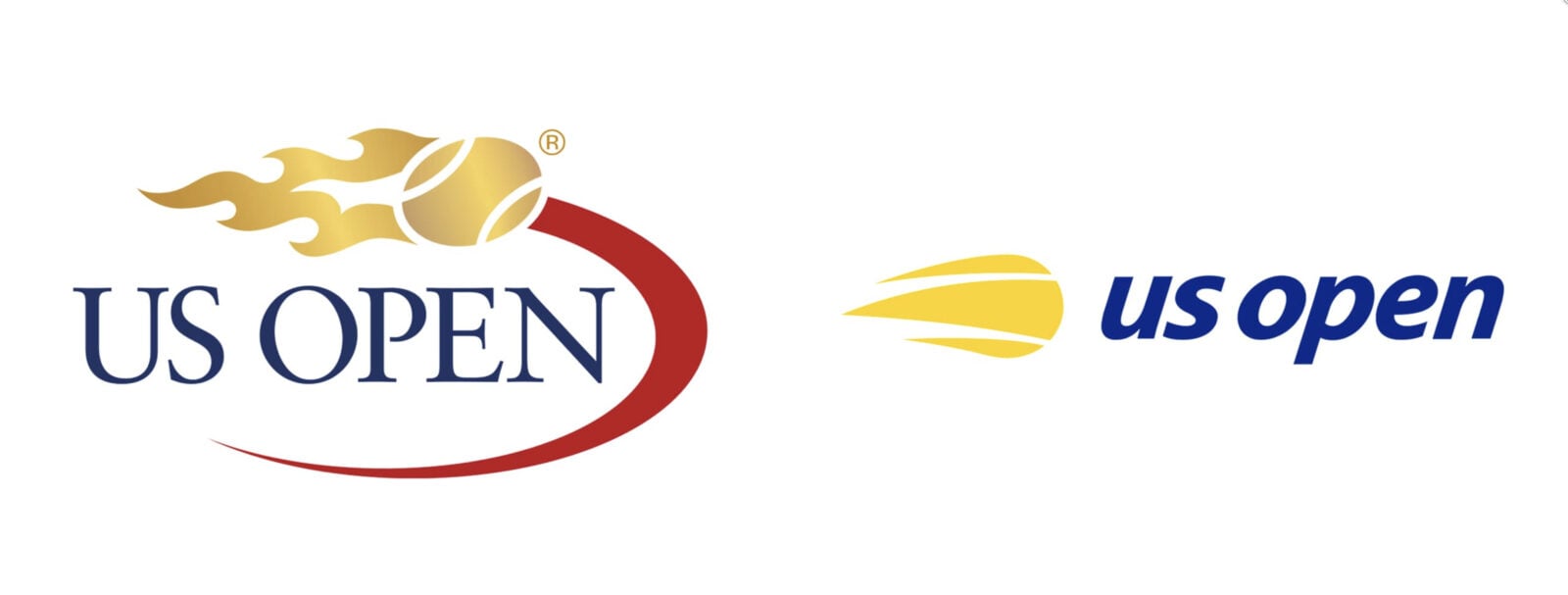
As explained on the Chermayeff & Geismar & Haviv project page: “The new mark is an evolution of the flaming ball idea, distilled to its essence to work as a simple icon. The new modern symbol is paired with an italic, lowercase sanserif typography, with the name held together by a flipped “u” and an “n.” The result expresses the energy, spirit, and velocity of the flaming tennis ball and the US Open itself, while modernizing the look, providing a more youthful appeal, and optimizing the identity for applications on everything from apps and Instagram to billboards, print ads, and swag.”
The rebrand has drawn a volley of disgruntled criticism from social media including comments such as:
“There’s ‘simple’, which is always favourable and hard to do well. And then there’s ‘simplistic’, which is always bad. This is on the side of ‘simplistic’.”
“It’s simplistic, not cleverly simple. Two different things. Take that icon on it’s own with no support and I wouldn’t have even known it represented a tennis ball. Sure, they can make it whatever they want stick because it’s already a successful entity, and it’s not horrible, but this is just outside the line in my opinion.”
“Where should I start! Everything is horrible. The wordmark has nothing unusual going, in fact, character axis is one degree away from falling on the face and that default Myriad Pro type, should I go more. The logo looks like discovered from somewhere in 90s.”
“Hey if you want to learn how to do graphics like that, I’ve got some old Computer Arts CD-Roms from 1998 lying around somewhere.”
And there’s plenty more where those came from.
Chermayeff & Geismar & Haviv are a very well respected firm having developed iconic brand identities for NBC, National Geographic and Mobile, although to be fair most of that work was done 50 years ago. Rightly or wrongly the agency is carrying the can for most of the negative feedback.
There’s no doubt creating a brand identity for one of the world’s most loved sporting tournaments would have been as thankless-a-brief as it would have been an exciting one. Almost regardless of the result there would have been pundits calling for a re-design. However, the simplistic design approach taken here could only ever end-up with a brand identity bereft of spirit, emotion and unique sense of the event – a great pity and a missed opportunity.
Dave Ansett
David is the founder of Truly Deeply, a brand agency with 25 years of experience working with brands to position them for growth. His deep expertise is in the creation of high engagement brands that attract the attention of their audience and stand out from their competitors. David has extensive experience working with corporate, retail, food & beverage and entrepreneurial clients. Find out more here
For monthly updates of our thinking, click here to receive our free Brand Newsletter
Pics from United States Tennis Association
I agree. This logo looks more like a bank or some financial business. A total miss. The previous logo has class. This current logo should be thrown in the trash. Why the US Open approved this is a mystery. The should get their money back and revert back to class and style. Just an informed opinion…
I totally love it. It is a tennis ball without being obvious about it. I communicates speed, energy, and has the flair needed for an event in NYC. Has presence on hats, the stadium, and ancillary items.
I don’t like the logo. A forever distinct U.S. Open Brand logo should be created .
They should have a logo contest (ages 10- 100) and the winning logo will go into print in 2028