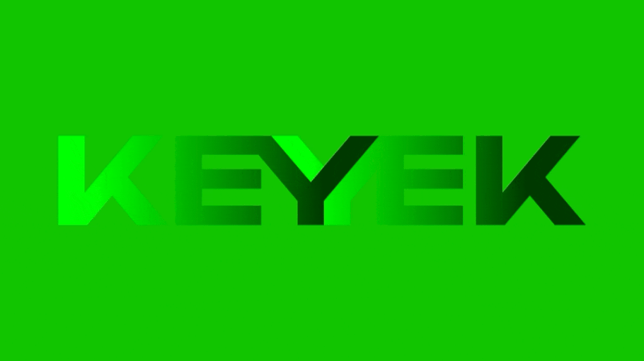
Archive for the ‘Brand Design’ Category

03

Recently, I discovered an inspiring short animated film – A Cautionary Tail. It is a 14 minutes film about a girl born with a tail that expresses her emotions. As a child, her parents celebrate their daughter’s eloquent, athletic appendage, and her tail inspires magical make-believe adventures with her friends. As she grows up, however, the young woman faces pressure to fit in, and must choose between conformity and self-expression. Read the rest of this entry »

integrated retail agency

Creating Relevant, Cutting Edge Retail Branding Doesn’t Mean Reinventing the Wheel
In 2012 fashion retail brand Burberry launched their remodeled store at 121 Regent St London. But what at first glance looks like a traditional retail re-fit is -on closer inspection – a blueprint for reinventing a brand experience inspiring for retailers across every category.

Read the rest of this entry »

crap4

Stand Back, its the Multi Proposition Super Brand
The first thing I have to admit is we didn’t create this brand – it’s not one of ours, but what the hell – something this cool should be celebrated all the same. And a truly clever bit of brand building it is too. Who Gives A Crap is a new entrant into the established toilet paper category, a category typically viewed as a commodity with undifferentiated product offerings. And-yet against this less than inspiring backdrop we have an inspiring challenger brand with the DNA to make a significant splash in the market.

Read the rest of this entry »

La Wine Agency a great brand

La Wine Agency is the brainchild of Brad Ball, a creative entrepreneur, restaurateur and sommelier. While completing his MBA in Bordeaux, Brad was assigned to create a business plan. As it turned out, this was the opportunity Brad needed to combine his love of wine and business ambition. Using his contacts in South America (former classmates while studying in Bordeaux) Brad turned his business plan for La Wine Agency into reality with the help of Fuzzco and Grassroots Distribution. Read the rest of this entry »

eat, branding agency

Typographic Furniture for Type Nuts & Bold Brand Statements

We love this range of typo-lounge-furniture from French design company TABISSO. The range which is aptly named ‘Typographia’ offers lounge chairs that incorporate all the letters of the alphabet and numbers 0 to 9. The range also includes 25 floor lamps shaped as different punctuation marks. The upholstery, which can be leather or fabric is available in a range of fabric colours allowing a match to existing corporate and brand identity designs.

Apart from the perfect foil for type lovers, this furniture provides a great visual tool for brands looking to communicate their message in a cut through manner. This bold furniture is perfect for weaving brand statements into hotel rooms and lobbies, restaurants, transport hubs, corporate brand environments such as foyers and reception areas, property development branding, and retail brands looking to add an extra dimension to their stores.

Read the rest of this entry »

image_01

Amidst a fitness craze, many Melbournians are looking for ways to get into shape – and with the number of gyms operating across the city, they aren’t short on options. But it all looks a bit monotonous, from a brand standpoint. There really isn’t much imagination in this industry. The wildly successful Fitness First have left behind a glossy, pearly-white smiles blueprint that has been appropriated to the point of genericness. One notable exception however, has taken its own approach in differentiating itself from the rest of its industry – and for that it has enjoyed quite a bit of success since its humble beginnings. Read the rest of this entry »

chancey-curtis

Before the invention of the vinyl plotter in the 1980s, the vast majority of signs, from shopfronts to billboards and even street signs, were painted or created by hand. Imagine the richness and variety of our high streets back in the day! Sadly, with its cheaper and faster production, the vinyl plotter turned the sign painting industry on its head. Artists were usurped by machinery and unskilled workers, and the craft was all but lost.

Read the rest of this entry »

Different types of the same PDF document

Same file format, different data, different results

PDFs are great. The file format has revolutionised our industry and the implementation of brand identities for our brand manager clients. They’ve simplified the process of review, proofing, alterations, approval and artwork. They go anywhere and can be viewed on just about anything. This is their real strength but it can also be a real weakness for the unwary.

Read the rest of this entry »

sa-brand-logo

We may be a Melbourne based agency, but we have a great love and empathy with South Australia.  Over the years we have been engaged with some wonderful people and brands, from the Eyre Peninsula regional brand (with its amazing seafood and entrepreneurial spirit) through to legends in the wine industry like Peter Lehman in the Barossa Valley.  Add to this the Coffin Bay Oyster farm and surely you are already beginning to sketch a mental picture of a state that gives birth to an amazing array of produce and wine. Read the rest of this entry »

Non intentional illusion in livery design

Recently on a trip to Portsea I came across some site-specific livery design. In fact, it was so specific it almost blended into its background, as though it was not there. However unintentional this effect was, it made me think of more deliberate and successful illusions created in branding and design. The visual tricks that designers create to make people take a second look.

Read the rest of this entry »